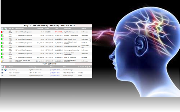
 Spitfire Management recently released a new version of its Spitfire Project Management System. One goal in this version was an easier-to-use, more intuitive UI (user interface). While we think we achieved the goal of making the software “more” intuitive, the truth is that whether a user thinks an interface is intuitive or not depends largely on that user’s experiences.
According to Everett McKay at UX DesignEdge, a UI is intuitive when “users understand its behavior and effect without use of reason, experimentation, assistance or special training.” Mr. McKay then goes on to define Intuitive UI as one that has an appropriate combination of
- Affordance- clues indicate the interaction
- Expectation- the result is predictable
- Efficiency- minimum effort is required
- Responsiveness- clear, immediate feedback of success is given
- Forgiveness- mistakes are not big deals
- No Frustration- users are satisfied
What Mr. McKay does not talk about is just how varied users’ prior knowledge (from experience in the real world or other software) is, and how challenging that variation is when designing an intuitive UI.
As an example, I have encountered frustration in both video games and phone apps because I couldn’t figure out how to do something I wanted to do. My millennial sons, however, always seem to know: “just click here…” When I ask, “how do you know that?” they shrug, “That’s how it is in other games/apps.” So, because they have grown up using applications that have increasingly put the onus of learning on the user (through trial-and-error more than documentation), my sons quickly try things and learn how to do everything possible in any new app. They now find most apps very intuitive.
On the other end of the spectrum, I find a number of Baby Boomers who struggle with the idea of “just click here”. They ask, “how would I know to do that?” If you ever see the words click here followed by a hyperlink, instead of just the hyperlink with its implied “click here”, you know that either the author or target audience is less comfortable with current technology.
So how to improve our software to be more intuitive for most users while not being confusing to any users? It isn’t easy. A survey asking our users to identify which icon best conveyed the idea of “click here to expand and get to more details” proved that there is no clear consensus on such matters. People who are used to certain software will say one thing, and people with different backgrounds will say something else. We are never going to be able to be 100% intuitive for all users.
Still, we do think Spitfire’s click-to-edit and click-to-filter functionality will prove to be intuitive once users realize that “just clicking” now allows them to edit or filter quite easily.
If you’d like to see our new interface yourself, contact us for a demo of the Spitfire Management System.
Tweet


 One of my favorite Broadway musicals is Stephen Sondheim’s
  I like to cook my own dinners. Often these dinners require some amount of chopping—of garlic, peppers, olives, tomatoes, parsley, etc. I’m so used to the chopping that I used to not think much about it, until I saw a nifty kitchen gadget called the